DESIGN IS HOW I THINK. CLAY IS HOW I FEEL. THIS IS BOTH.
I’ve been designing longer than I’ve been throwing clay.
This portfolio shows client work I’m proud of, commissions that pushed me, and a brand that’s CONTINUOUSLY Being refined.
GOODYNUF · CUSTOM COMMISSIONS
2020 - PRESENT
Affinity Designer · Procreate · technical illustration, product development
My BFA in Architecture never left the studio
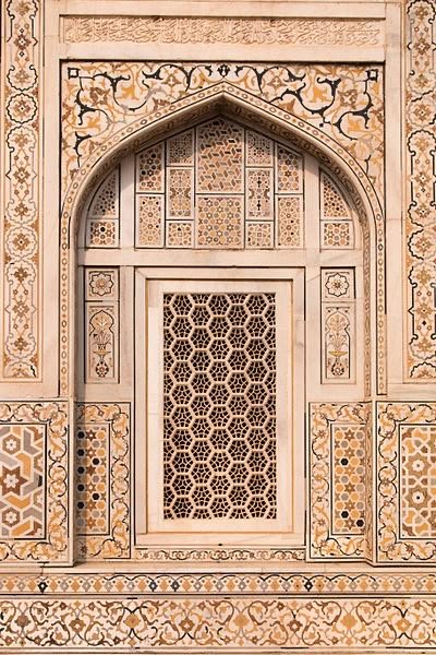
For custom commissions, I create detailed sketches inspired by the drafting language I learned in school. Dimensioned elevations, material swatches, section-inspired layouts, scaled title blocks drawn in Affinity Designer on iPad.
It’s not AutoCAD, but it speaks the same visual grammar: clarity, precision, and respect for the person receiving the document. A client should be able to understand exactly what they’re ordering before clay is ever touched.
Every commission runs on the same structure. A discovery conversation, a spec document for client approval, defined milestones, and a lead time communicated before work begins. Clients are always pleasantly surprised. That’s the goal.
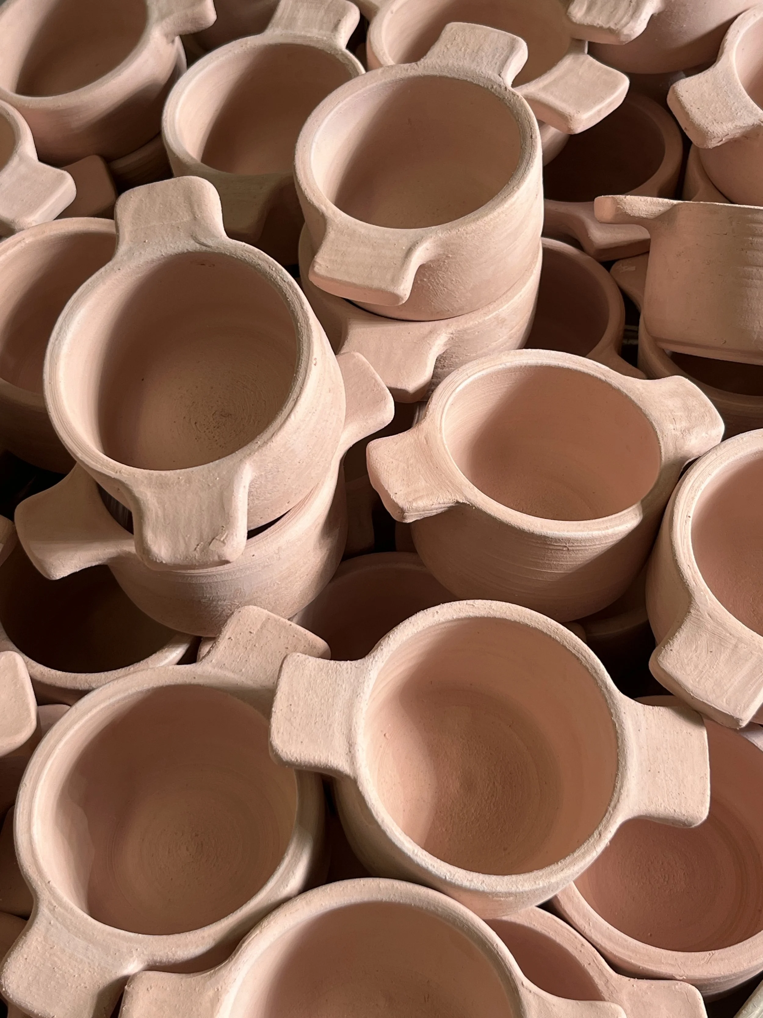
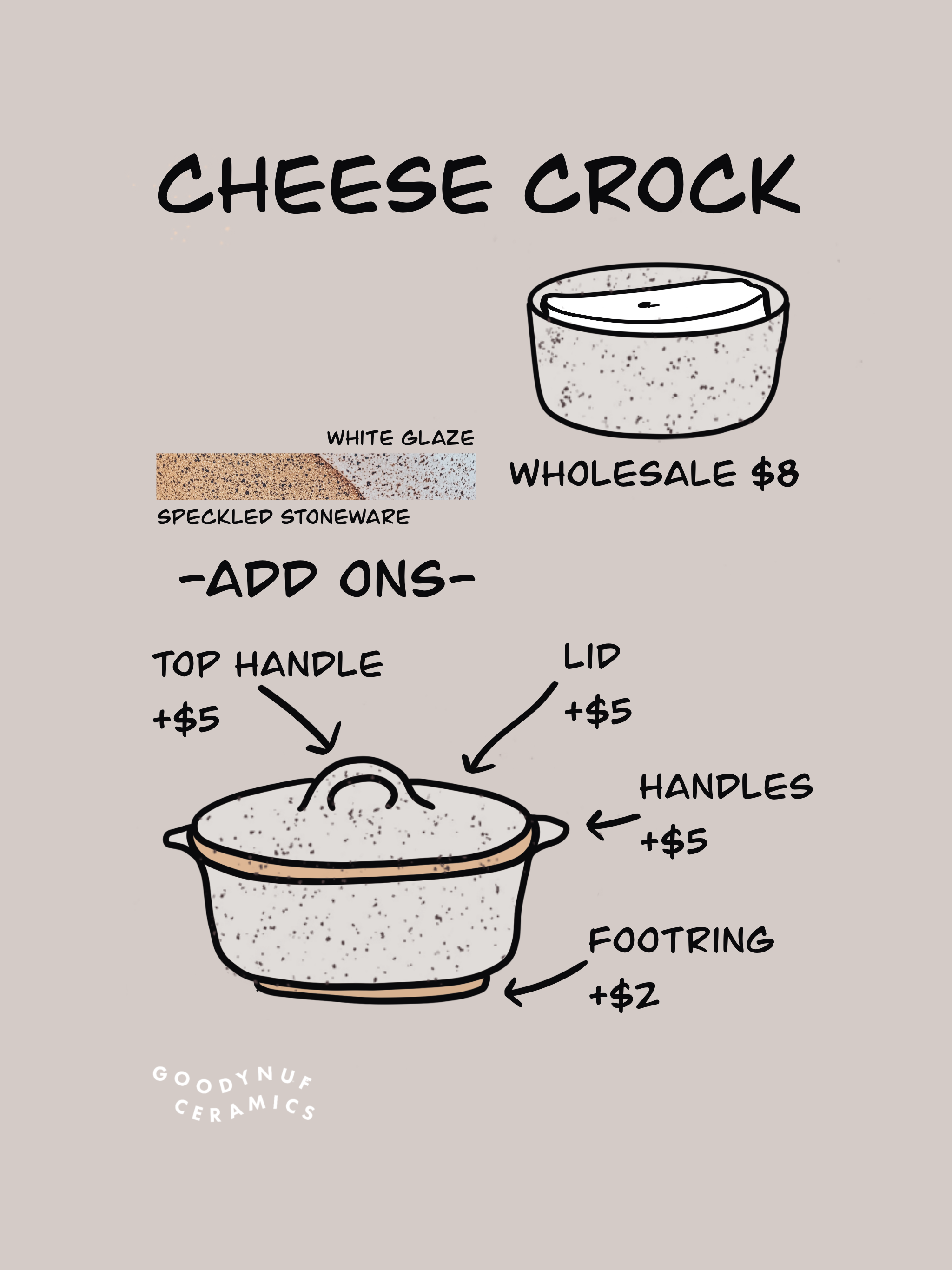
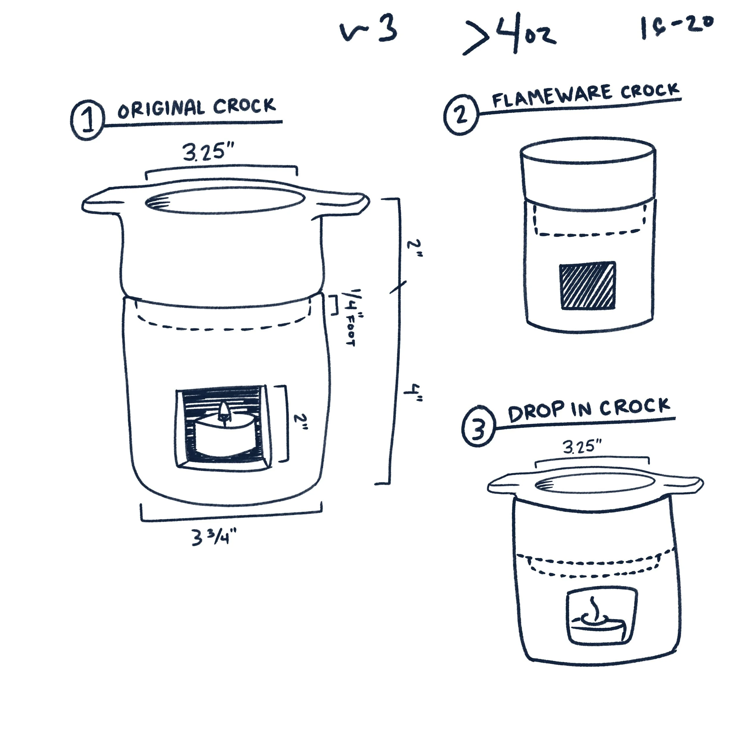
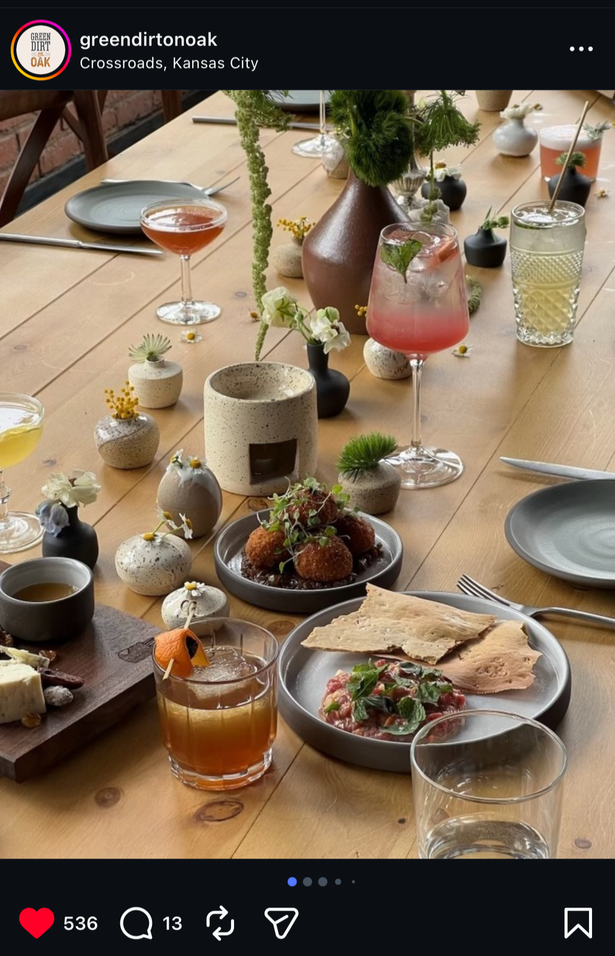
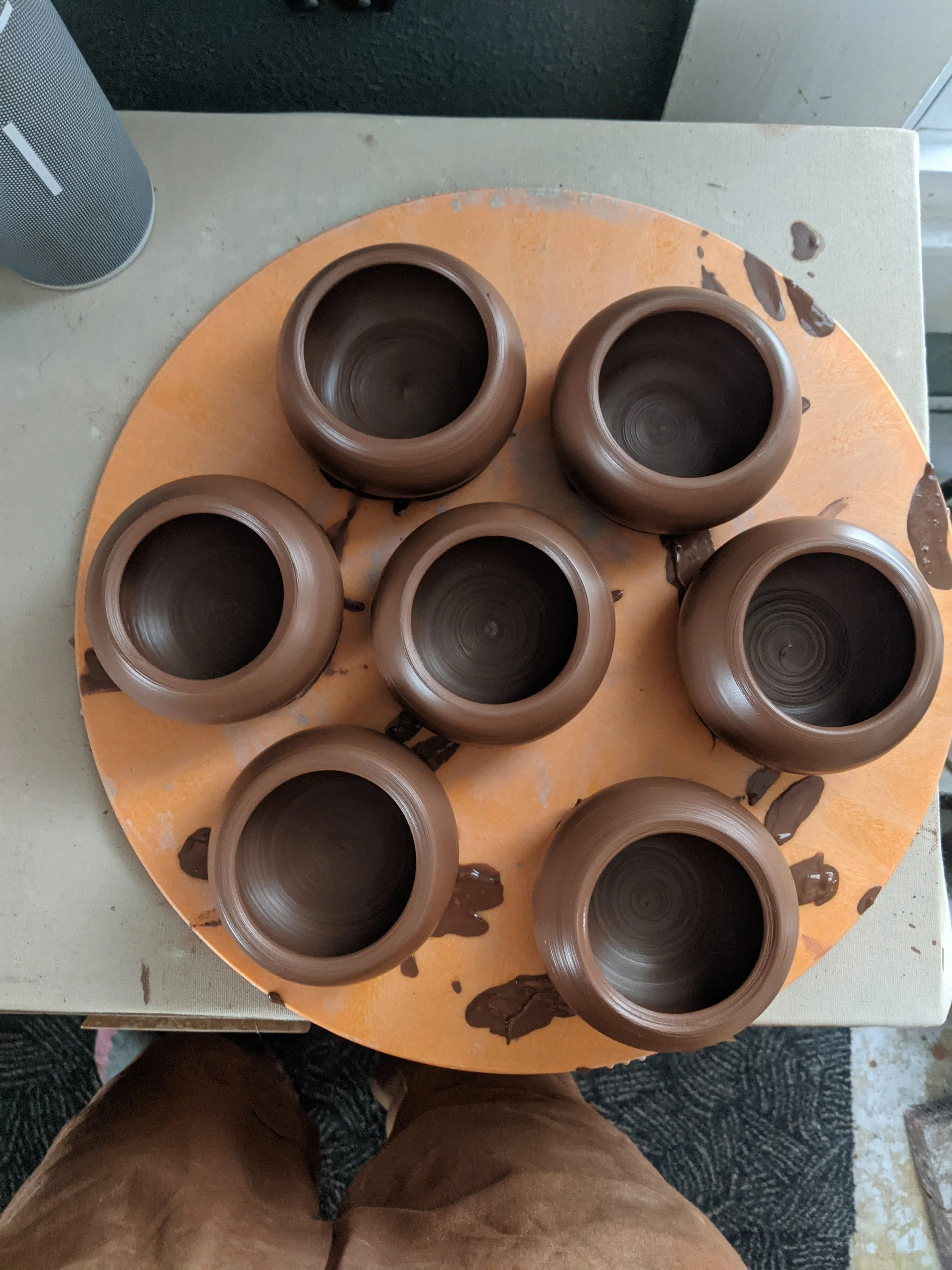
Green Dirt Farm Creamery · CHeese crock + Bagna Cauda + BUD Vase Collection
A multi-year relationship with Green Dirt Farm and their restaurant Green Dirt on Oak, named Kansas City’s best restaurant of the year upon opening and photographed by Anna Petrow, whose work has appeared in the New York Times and Travel + Leisure. That’s the context this work lives in.
The cheese crock collection ran across multiple production cycles over four years, each run refined from the last. The Bagna Cauda vessel, a candle-warmed crock designed for table side service, required solving for flame resistance, heat retention, and three distinct configurations before a single piece went into the restaurant. Client approval at each stage. No surprises at installation.
This is what long-term client relationships actually look like: iteration, documentation, trust built slowly, and objects that earn their place on the table.
What I’d do differently: This was my first large-scale wholesale commission. 100 pieces due during the holiday season. The scope was workable, but the timing wasn’t and I didn’t push back until later runs. Eventually I did. The lesson was that a client relationship only stays good if you’re honest about capacity from the start. The work got better every year precisely because I got better at that conversation.

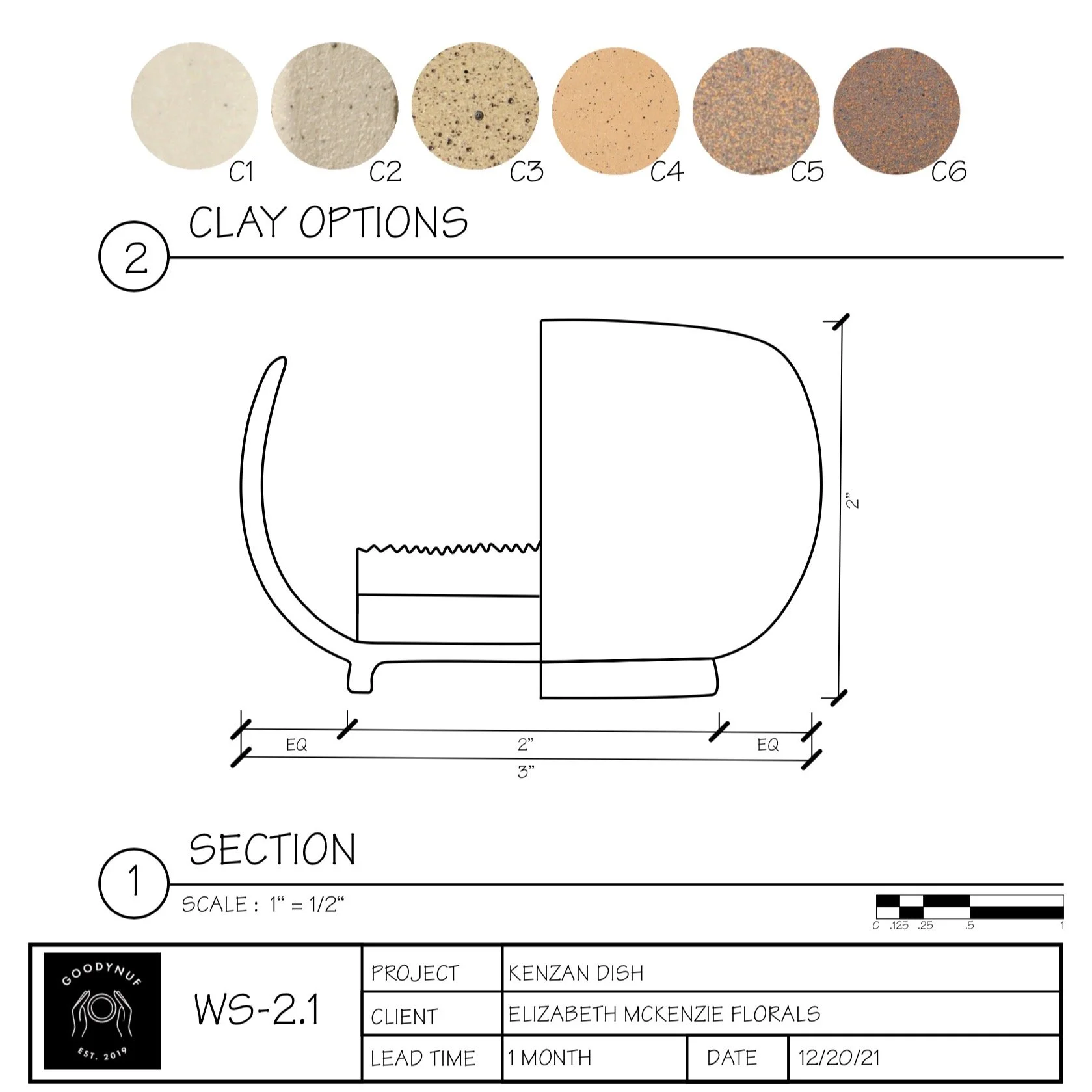
e.m.k. FLORals · kenzan dish
A commission for a working floral designer who needed a functional flower frog that could disappear into an arrangement. Delivered with a full spec drawing, clay options, dimensions, and section view. The client could approve the form before any clay was touched. The finished piece did exactly what it was designed to do: hold the flowers and get out of the way.
What I’d do differently: Nothing about the process. I’d do more of them.
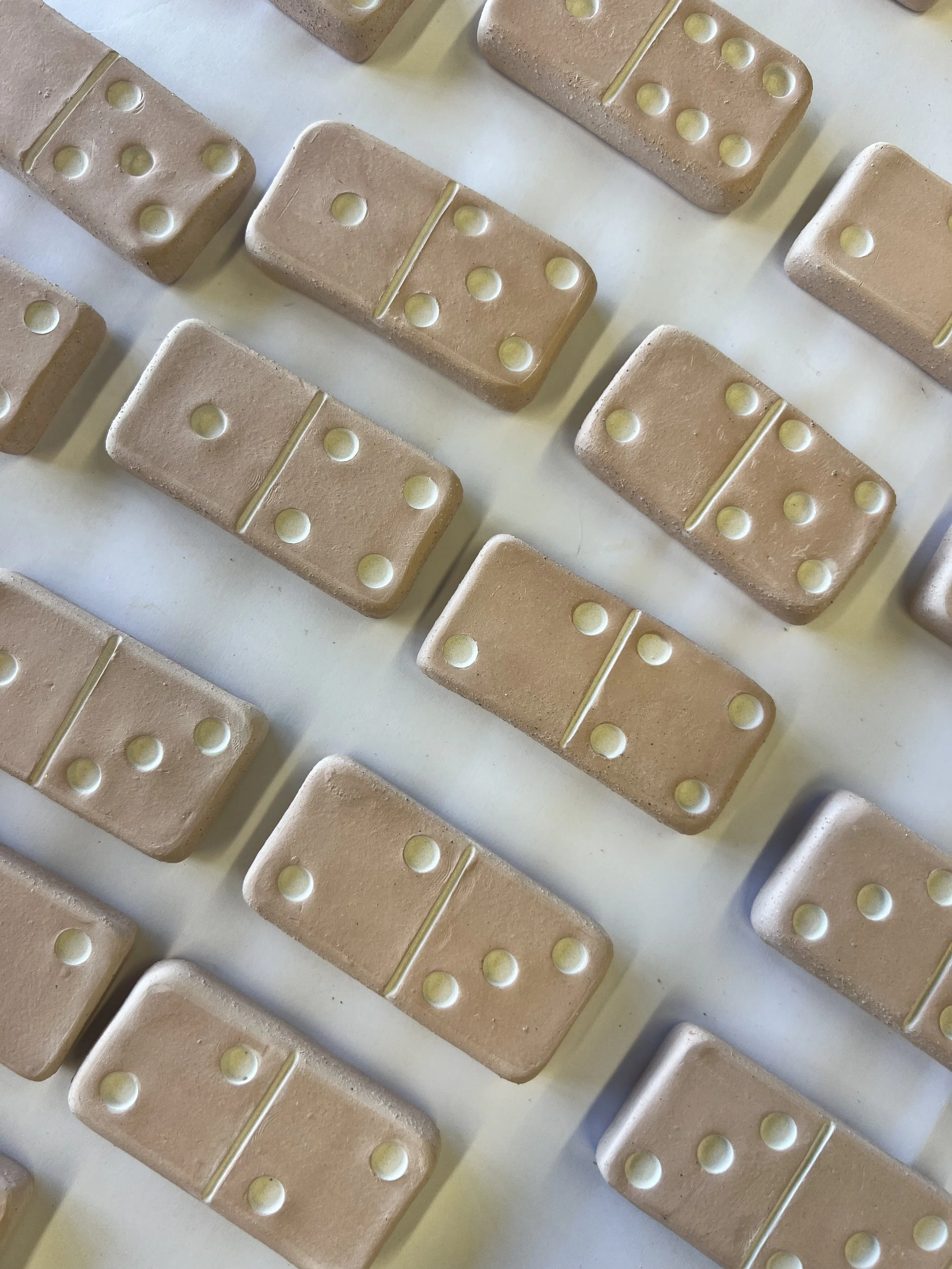
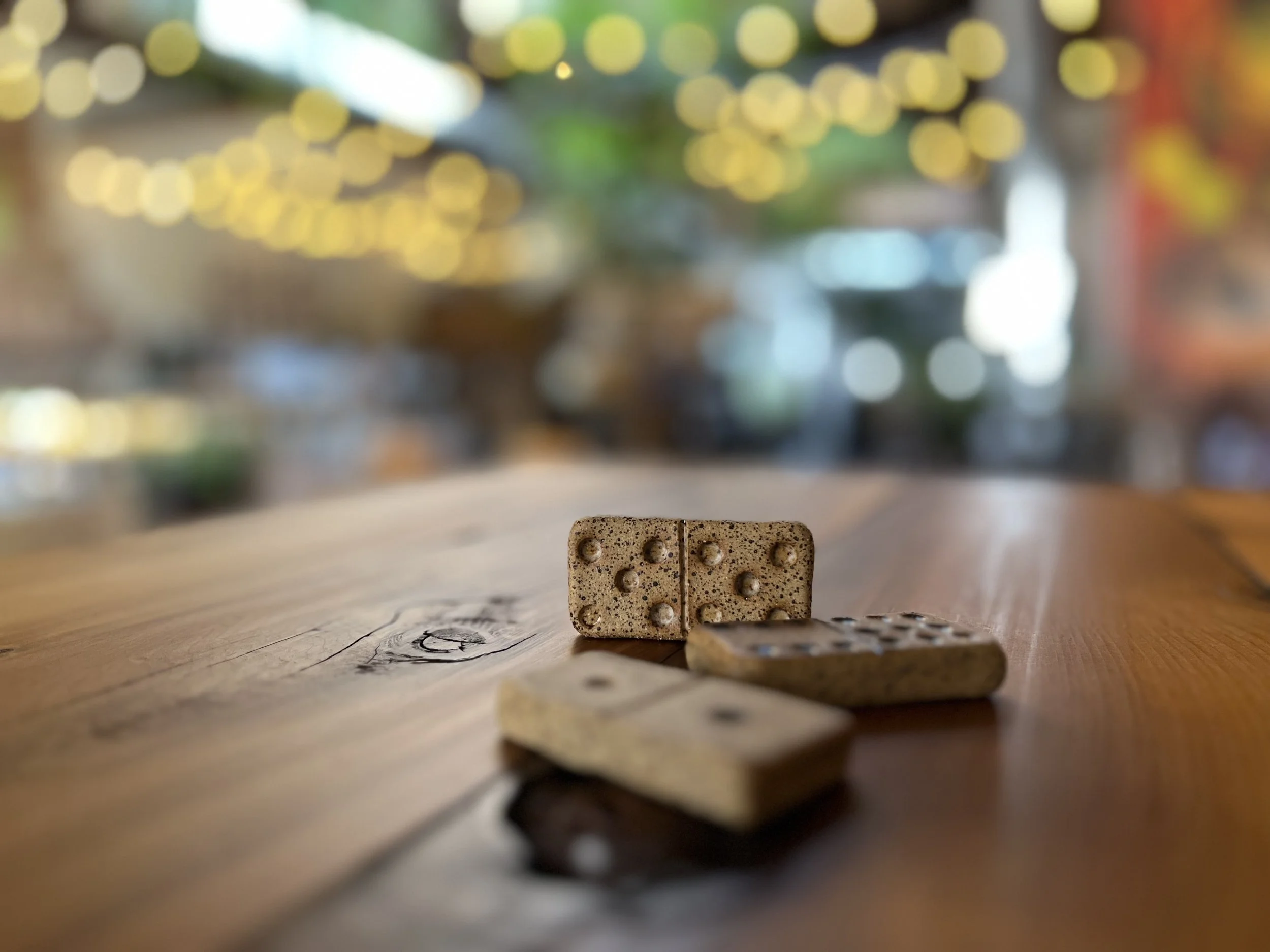
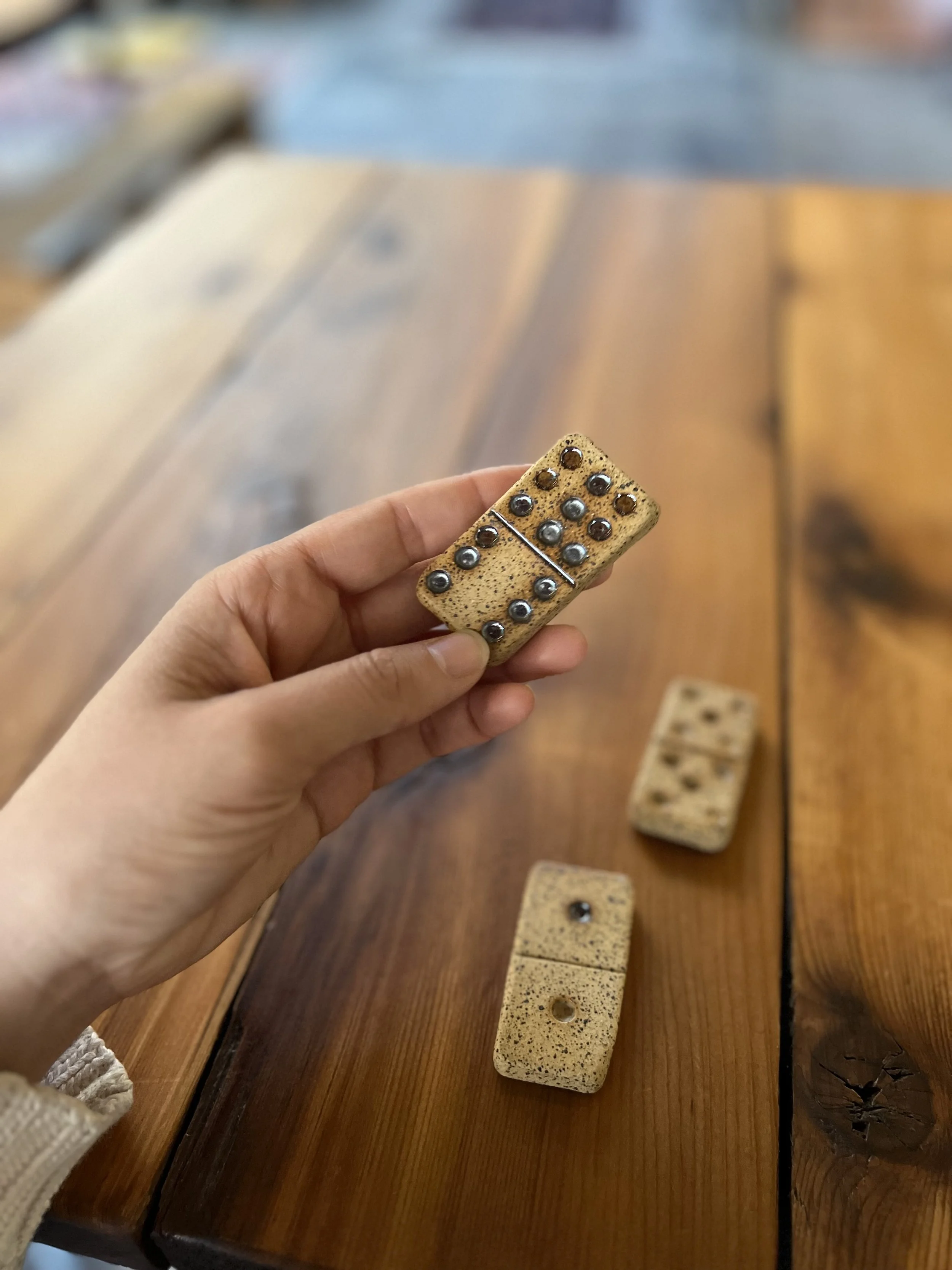
Birthday · dominos
A birthday gift for a dear friend who loves dominoes. A full set, hand-built with slabs in speckled stoneware with a soft matte metallic glaze that complements the manganese flecks in the clay body in a way I didn’t fully anticipate. Tactile and satisfying.
I always make extra. Learned that working in high-volume ceramic production. The kiln has opinions, and you’d rather have too many than come up short. The extras came to pop-ups and became some of the most touched things on the table.
Hand-building is not my natural language. I’m a wheel thrower. This was a slow, deliberate departure and I’m proud I gave it a go.
What I’d do differently: a press mold. The hand-built process is beautiful but not scalable, and demand has made it clear these could be a real product. A mold would let me maintain the tactile quality while building capacity. Still a wheel thrower at heart but this one earned its place.
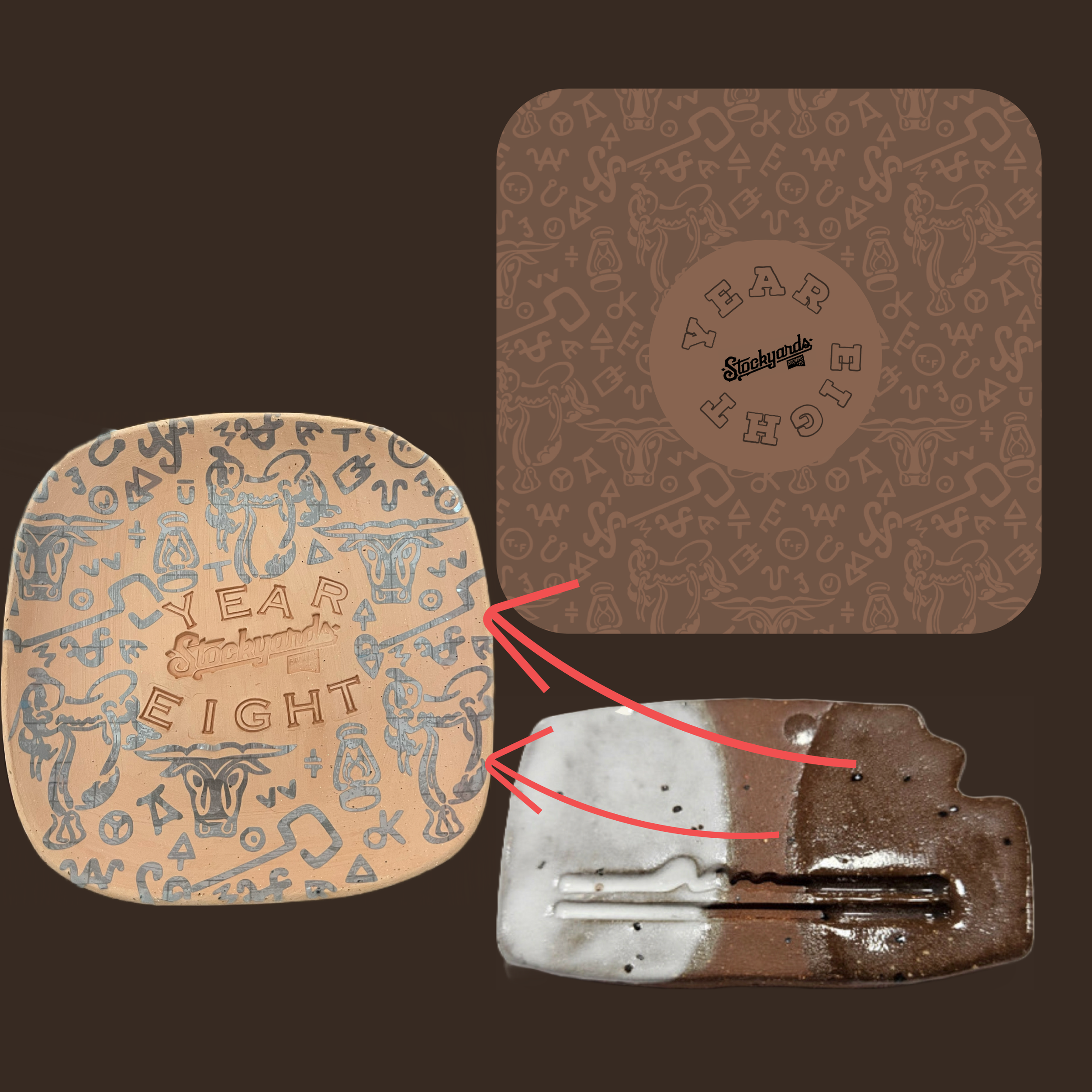
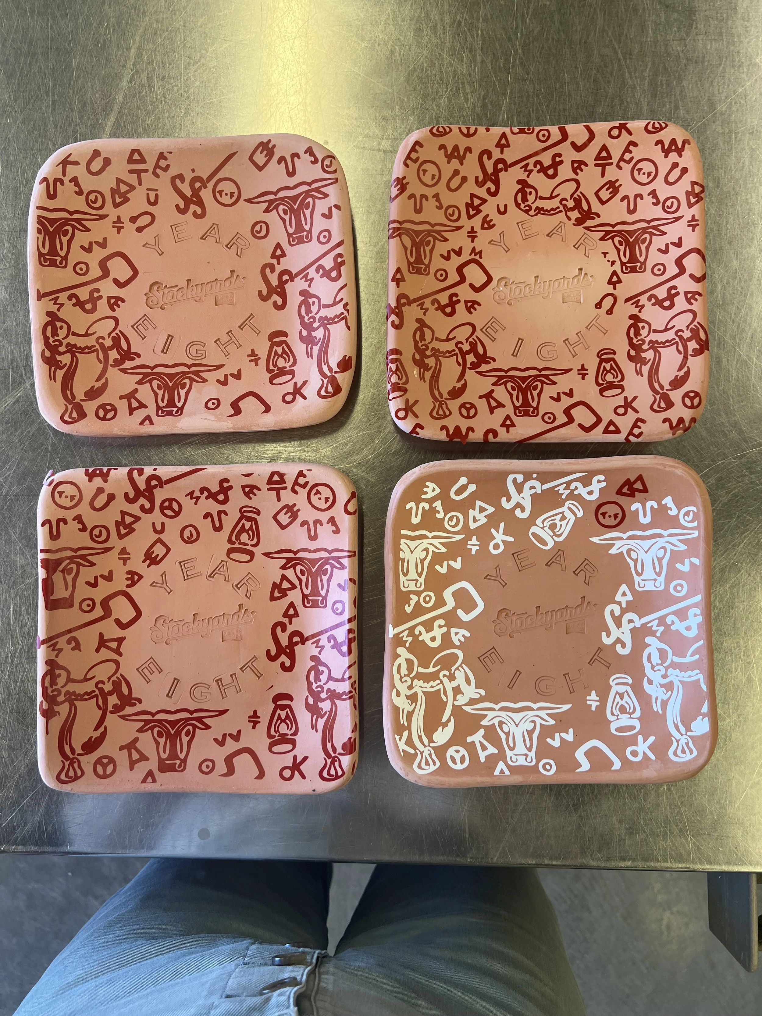
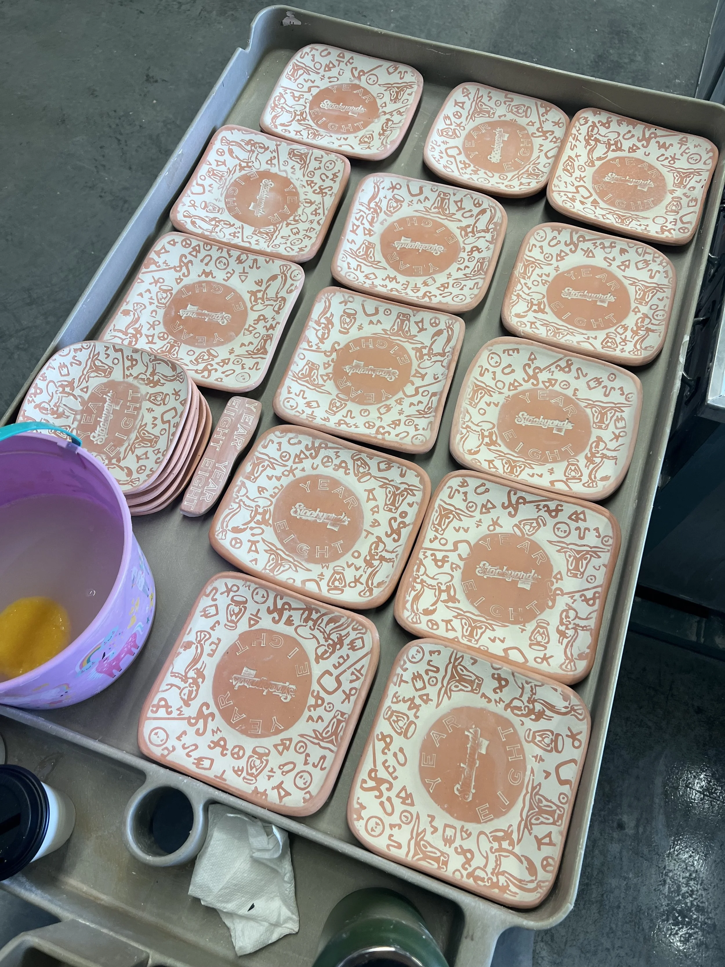
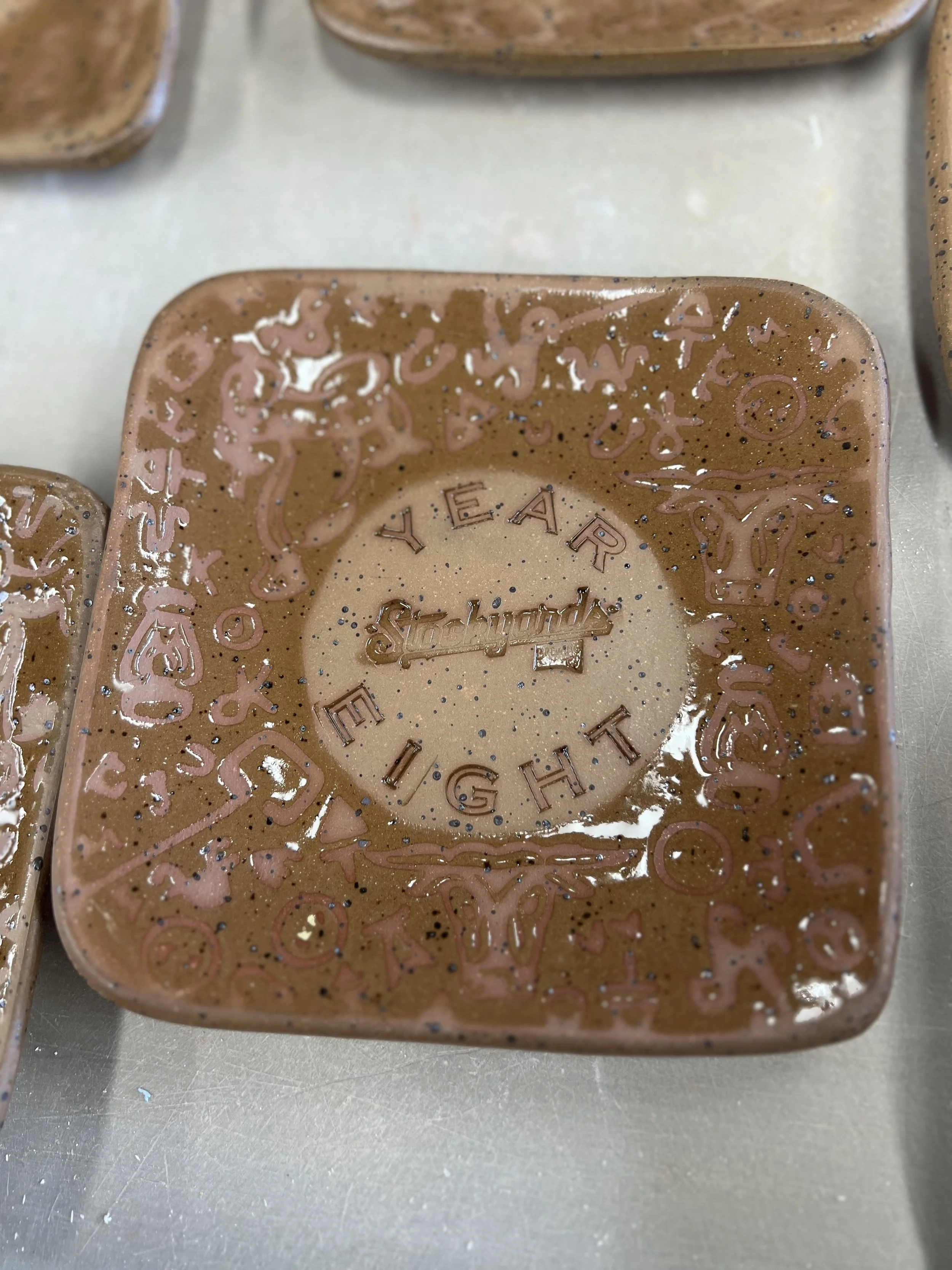
Stockyards Brewing co. · Year Eight Anniversary Catchall Tray
A brand commission born from the KC small business ecosystem. Friends in the brewery world needed something handmade for their eighth anniversary. I translated their vintage carpet design into a PNG, using a specialized design software to cut vinyl sticker stencils with Cricut, a computer controlled plotter, sourced metal stamps from a leather craft supplier, and hand-laid everything on bisque ware before glazing. Not my usual aesthetic and it turned out better than expected.
What I’d do differently: Tar paper stencils instead of vinyl adhesive. More sustainable and it would have sped up the process considerably. I’d also time the first tray and reprice from there. The work was undervalued because I was estimating, not measuring.
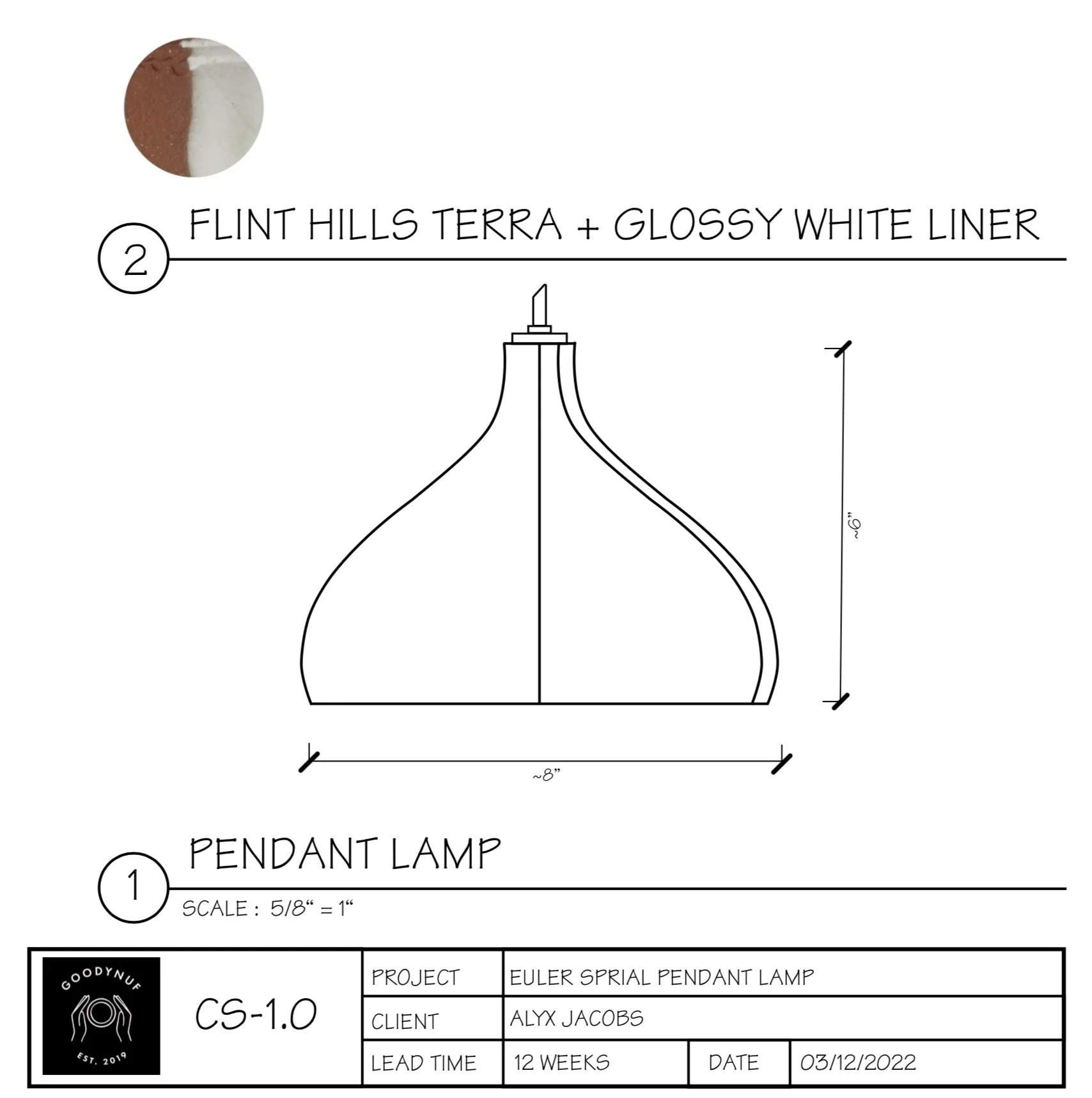
Euler spiral Pendant Lamp · in development
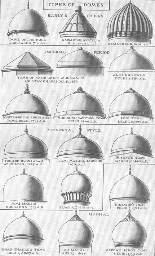
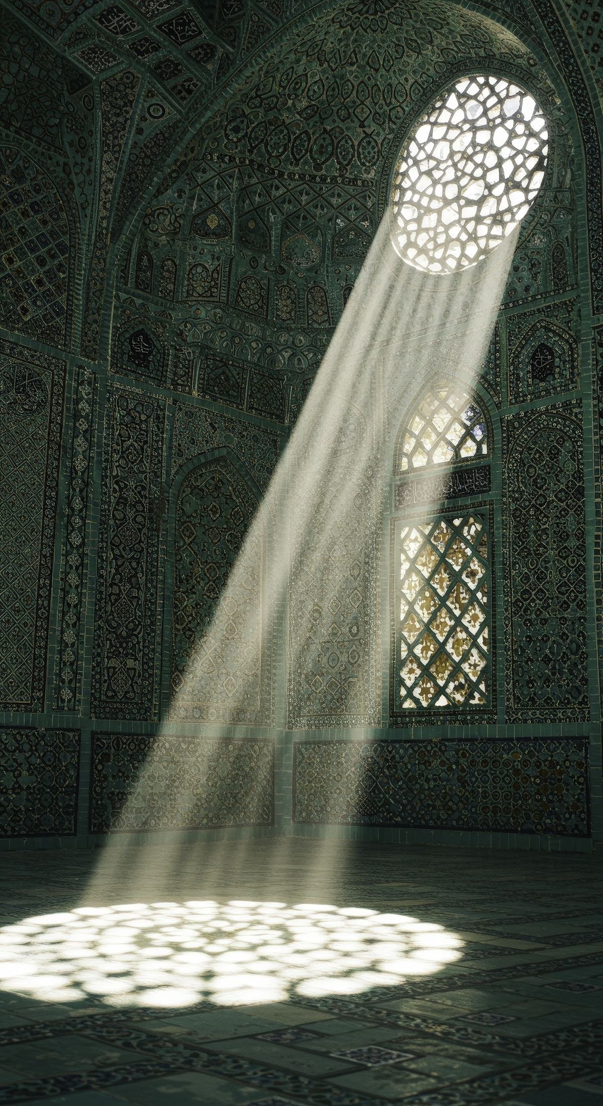
What started as a commission became something else. The brief has relaxed. This is a collaboration with a friend who understands that good things take time and the design has moved into new territory: ceramic lantern forms with geometric cutouts inspired by South Asian architecture, jali screens, and the way Islamic design tradition uses light as material.
For someone who defaults to minimalism, this project has been a reckoning. The restraint I’ve always practiced came from watching ceramicists overcommit and burn out. I’ve been selective deliberately, holding a full time job and protecting my creative energy. But this direction wakes something up. The lantern isn’t finished. Neither is the conversation between my heritage and my hands.
What I’d do differently: Ask me when it’s finished.
CA BREWING CO.
2018 - 2025
Adobe Express · Social, operational, and multi-platform design
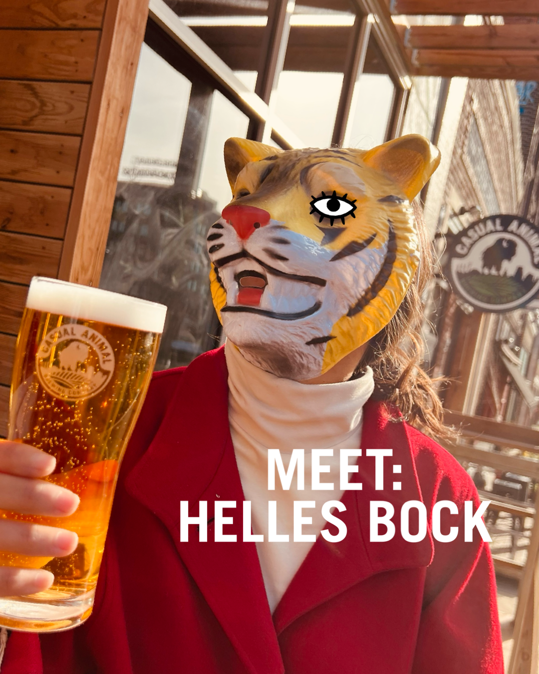
I joined Casual Animal as their first bartender. When one owner revealed she was pregnant within weeks of opening and couldn’t keep up with content, I stepped up to the plate. What started as photography evolved into reverse-engineering a brand aesthetic from scratch. I worked directly with another owner who was a graphic designer, which meant every piece went through multiple rounds of revision. It was my first real lesson in the difference between executing a vision and chasing approval.
Over time the work expanded beyond social media into SEO, copywriting, website content, calendar and CRM for The Pitch and Visit KC. I also contributed to wayfinding and operational signage - bathroom signs, water station markers, menus - which taught me that design isn’t just aesthetic. When signage doesn’t work, the whole operation slows down. The venue grew from a 150-person taproom to 500+ capacity during my tenure.
What I’d do differently: Start with a brand discovery session. I later witnessed that process firsthand through a civic branding project with Whiskey Design and understood immediately what had been missing - a shared creative brief before any design begins.
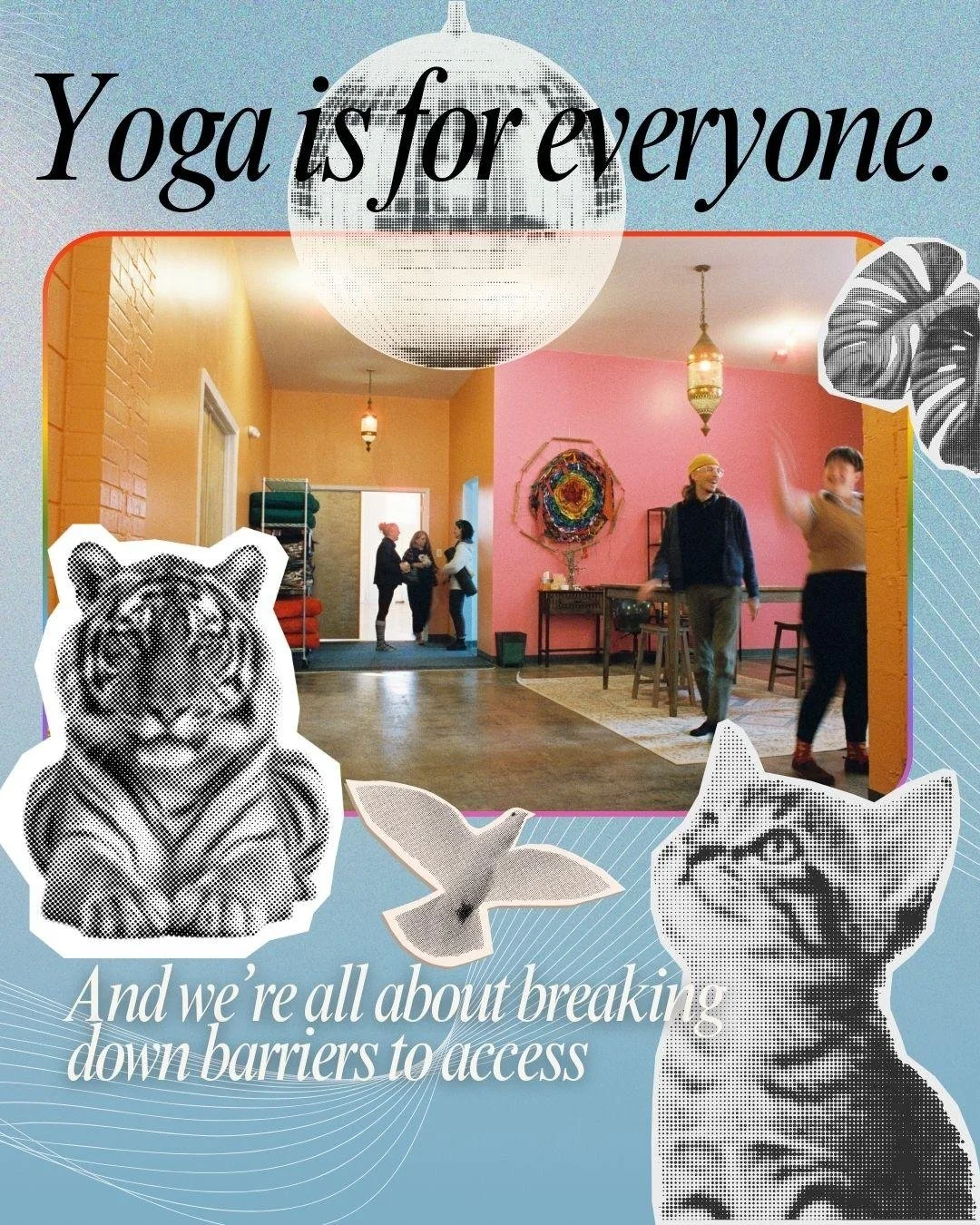
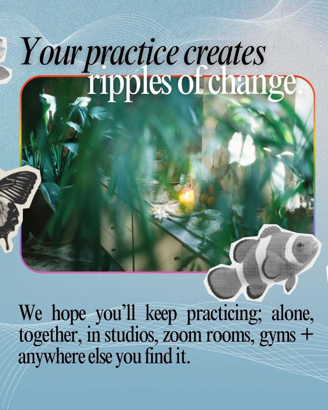
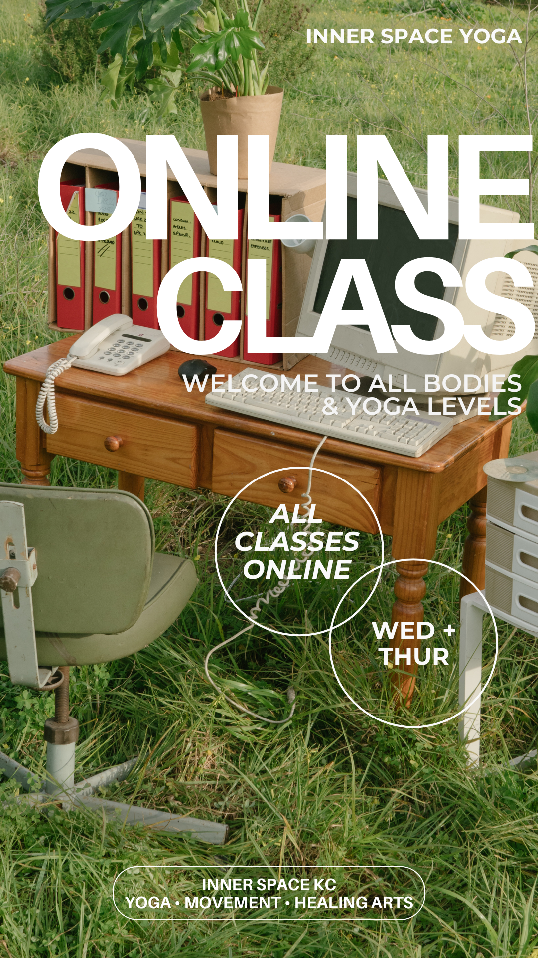
INNER SPACE KC Yoga studio
2024 - 2025
Canva · Wellness, community, multi-platform design
This relationship started as a barter: design work in exchange for yoga and qigong classes. There was no logo, no brand guide, no visual starting point — just a lot of energy and a community that needed to find each other. I developed a reusable Canva template system and built as much visual cohesion as possible across a high-volume, fast-moving posting environment where multiple teachers were creating their own content simultaneously.
I discovered the public domain during this project and began using archival imagery to elevate templates I was handed, a move that became instinctive. I also contributed design support to a fundraising campaign that helped raise approximately $40K for building renovations, working within an external financial platform’s brand constraints while keeping everything as cohesive as I could.
What I would do differently: The pace was challenging. Same-day requests were common and the biggest lesson was that knowing what you want to say is not the same as knowing what you want to communicate. Content strategy has to come before design. I’d begin any similar engagement with a discovery conversation: who are we talking to, what do we want them to feel, what’s the one thing we want them to do.


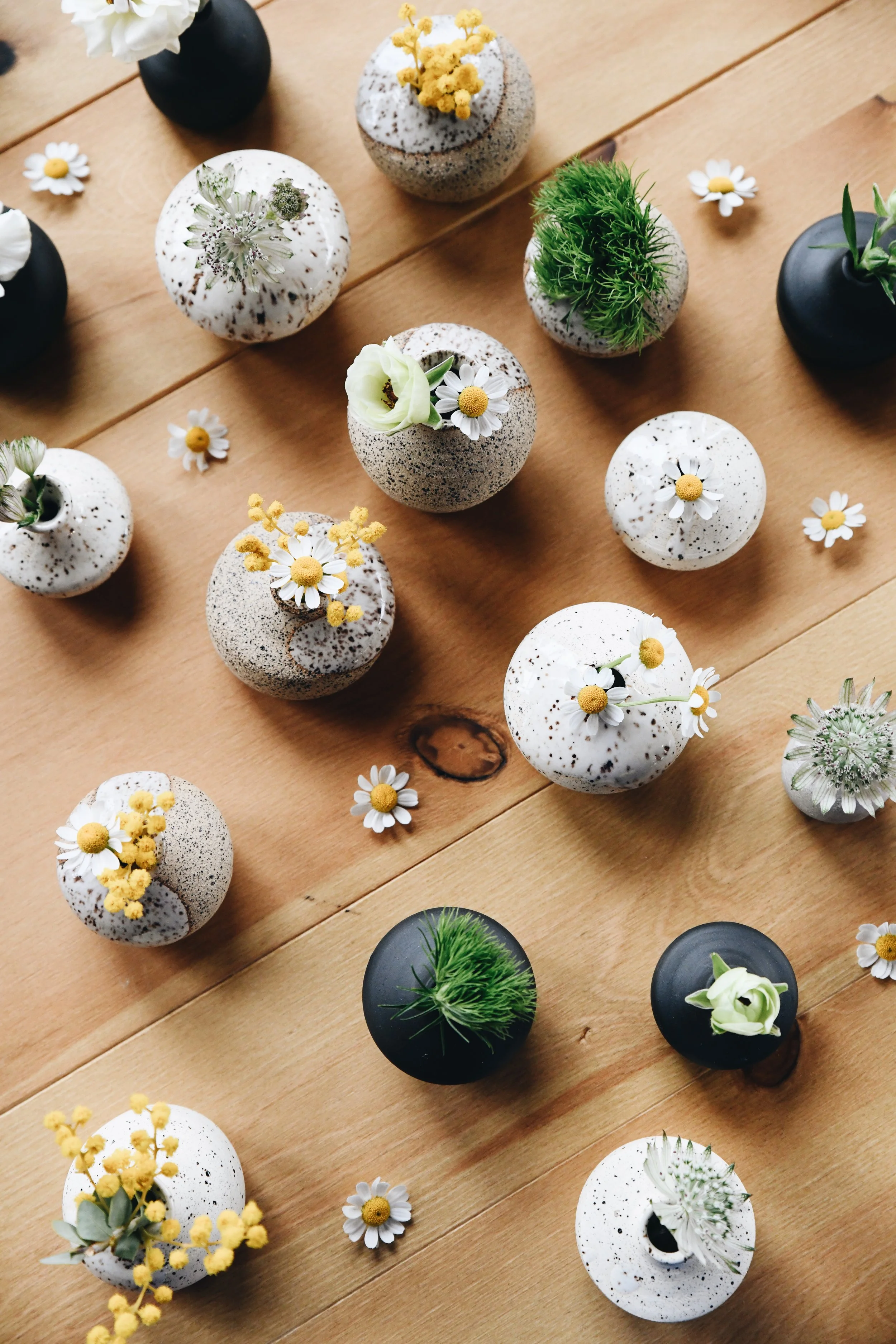
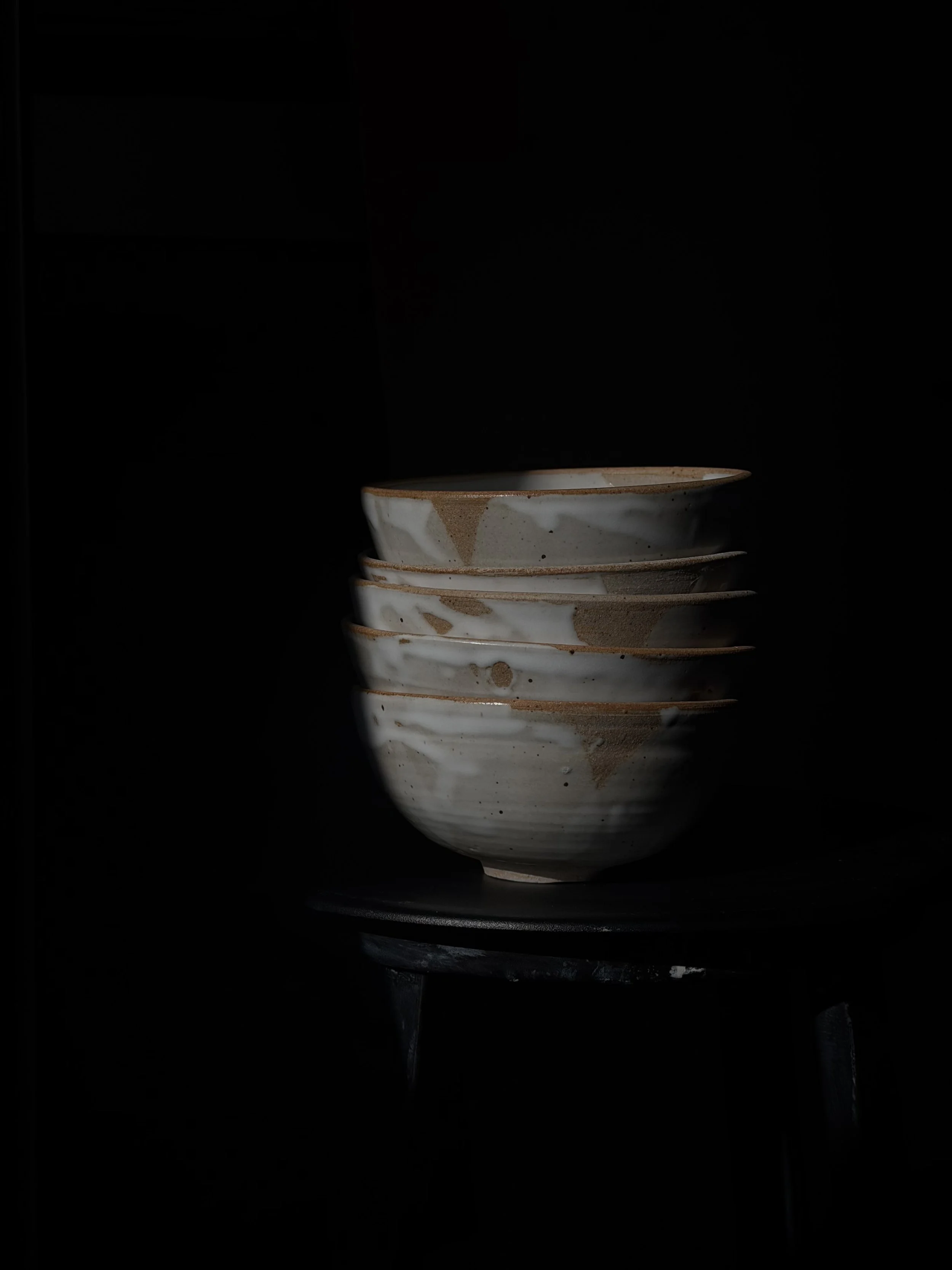
GOODYNUF · slow cookeD ceramics
2019 - present
Adobe Express · Affinity Designer · Procreate · Canva · Squarespace
Owner, creative director, maker — brand identity, marketing strategy, e-commerce
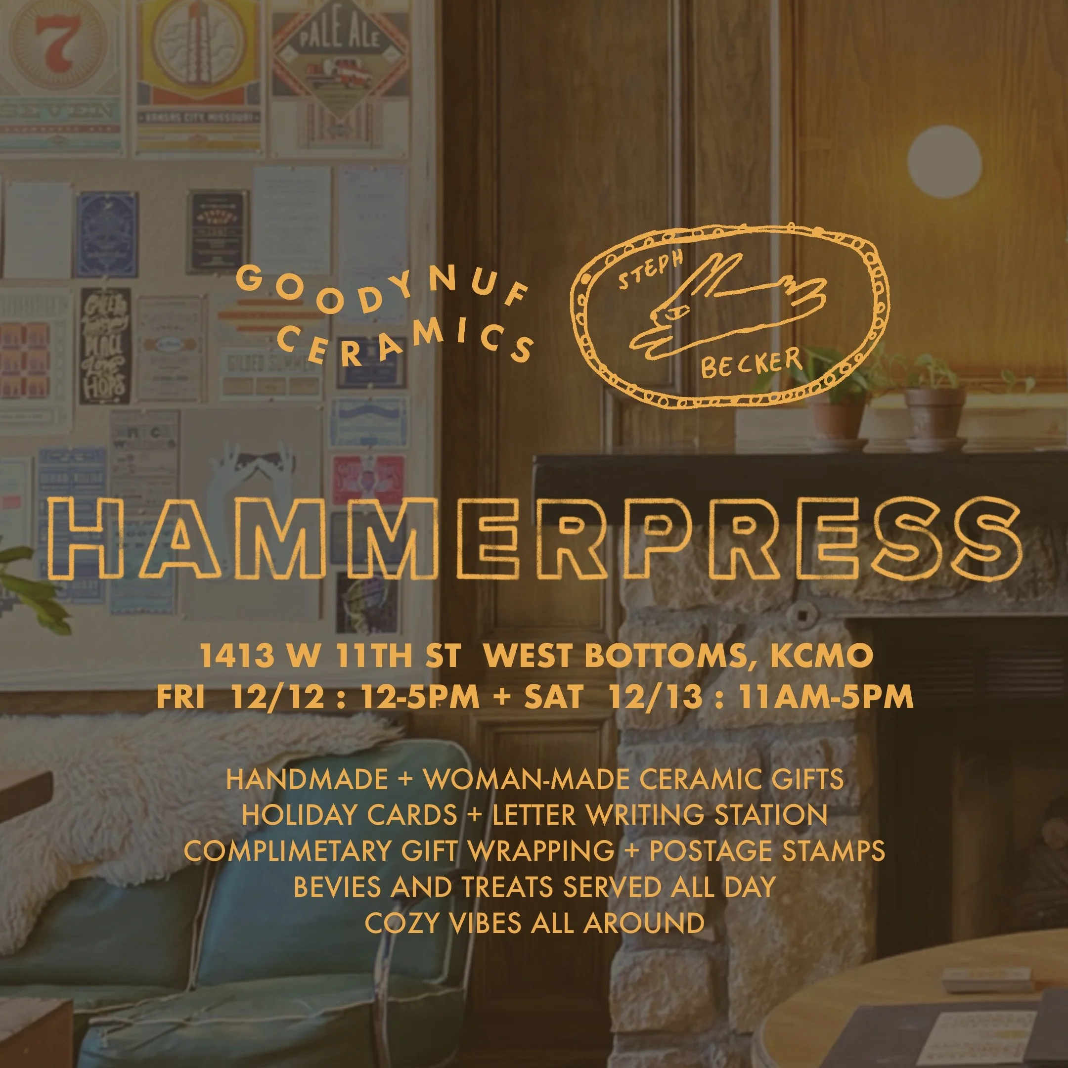
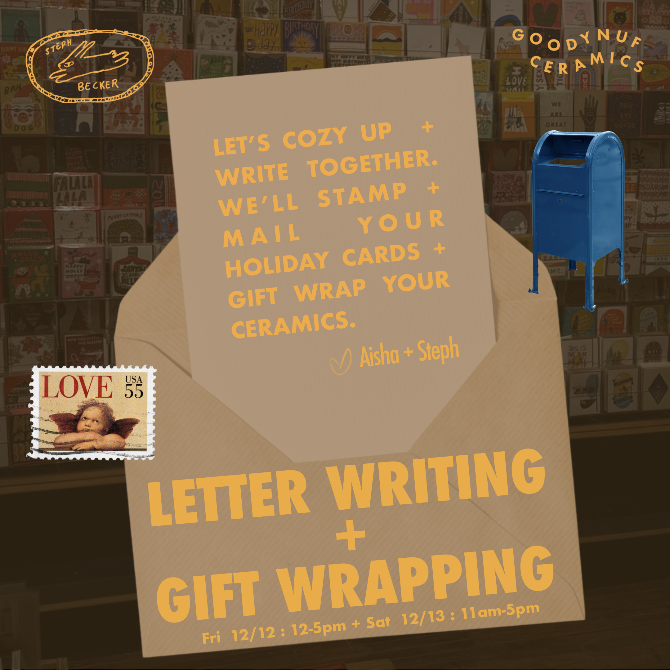
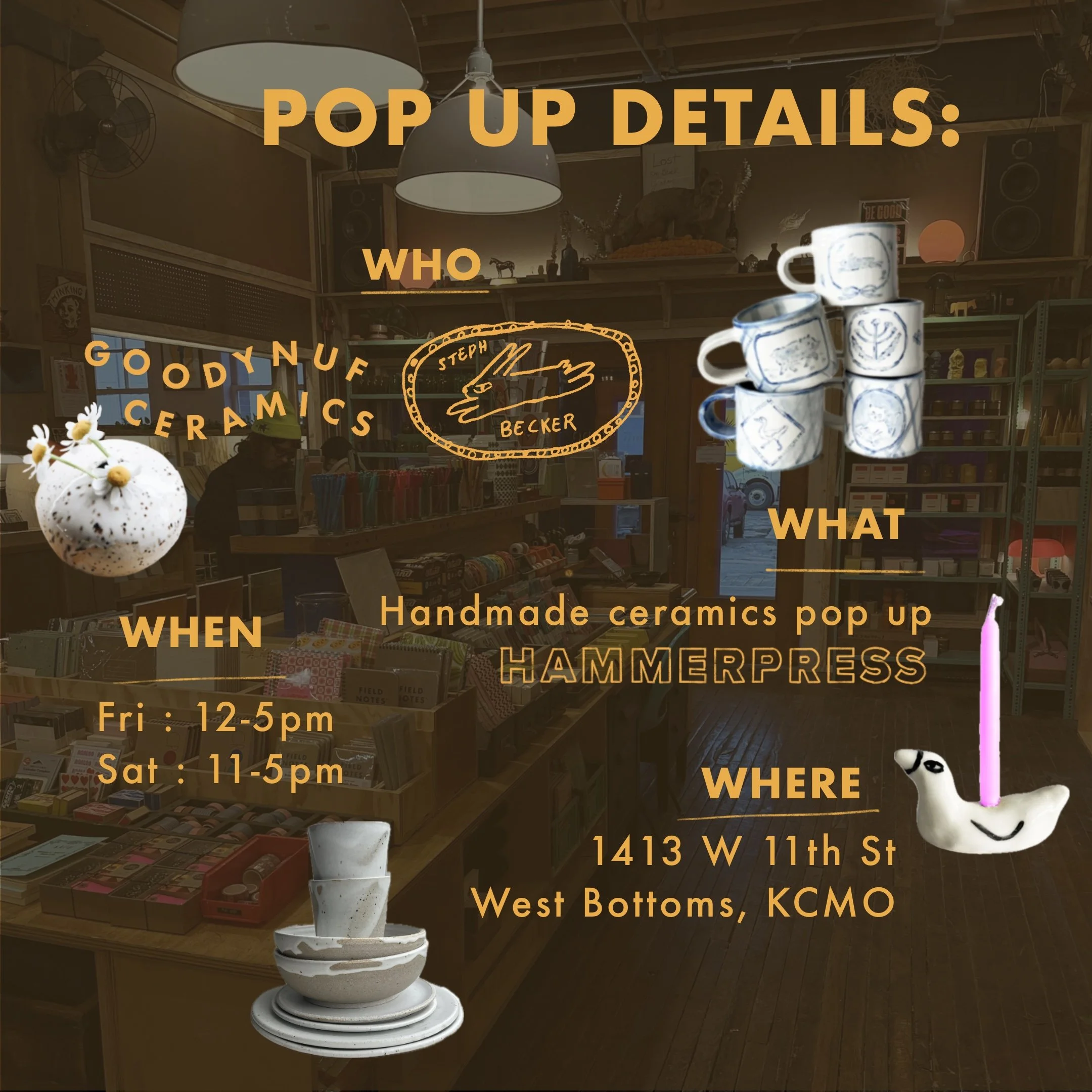
GOODYNUF is where I set the guidelines instead of following them. Founded in 2019 after burning out helping run someone else’s business, the brand philosophy, intentional imperfection as a form of contentment, emerged directly from my ceramics practice and has shaped every design decision since.
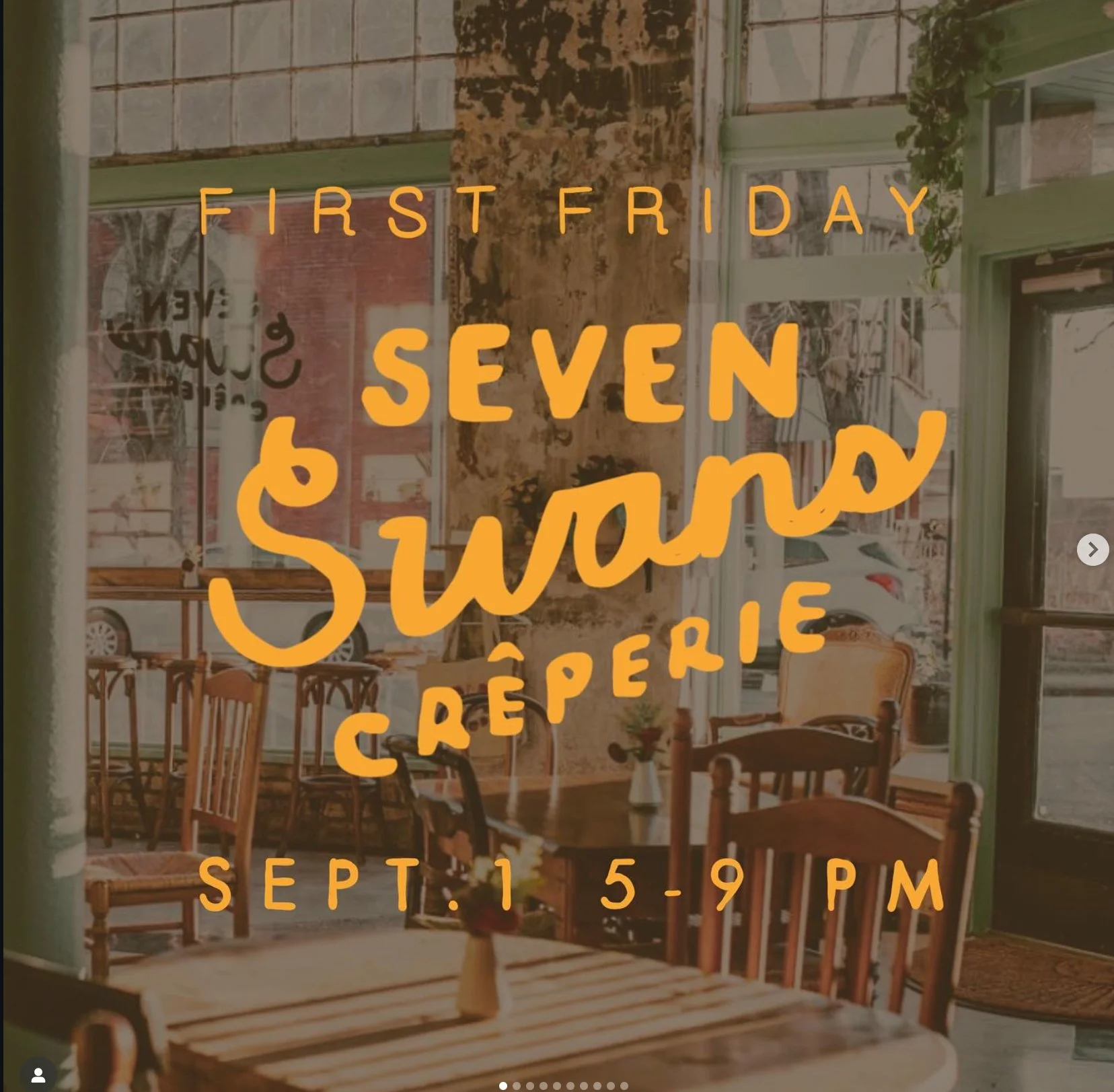
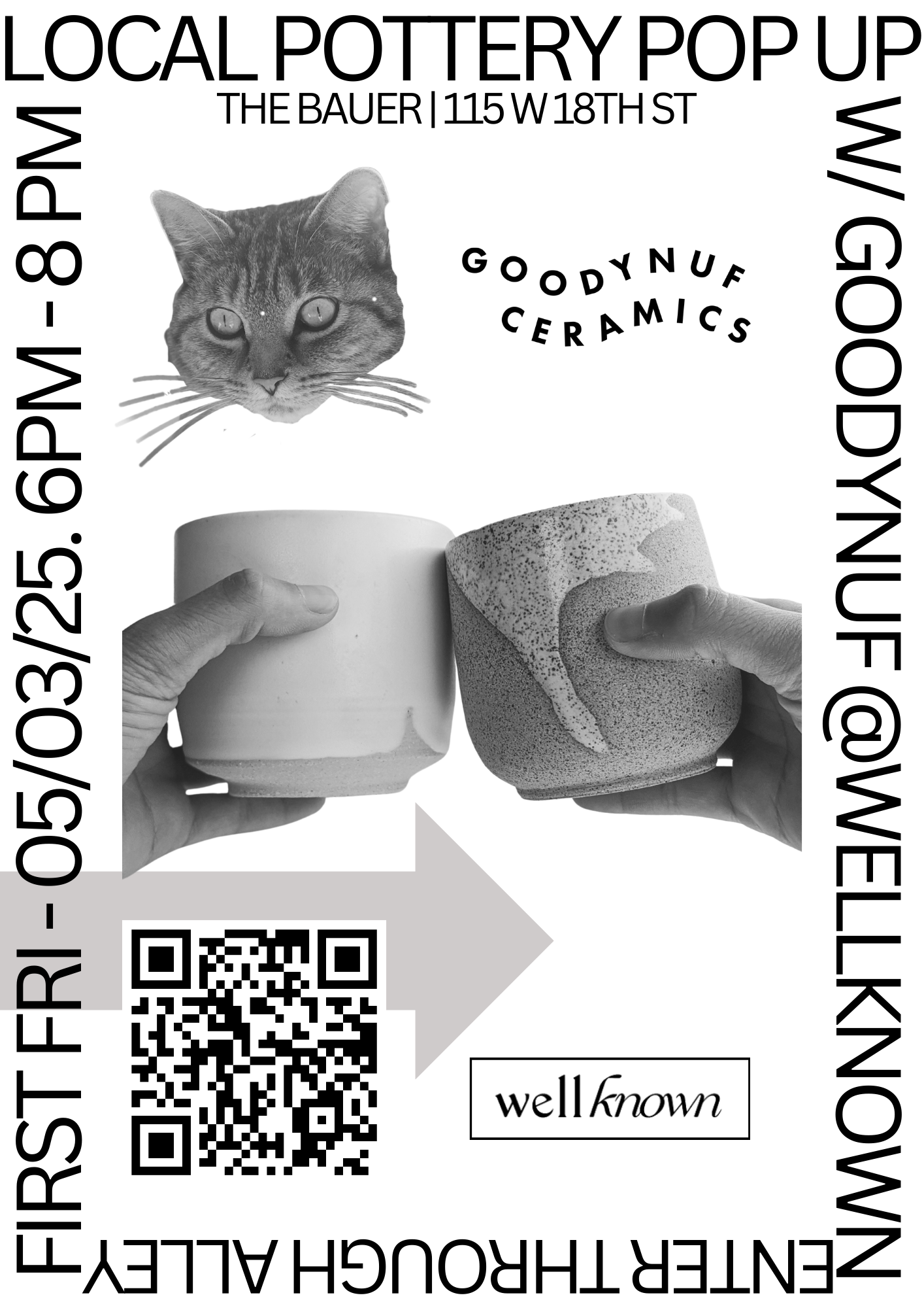
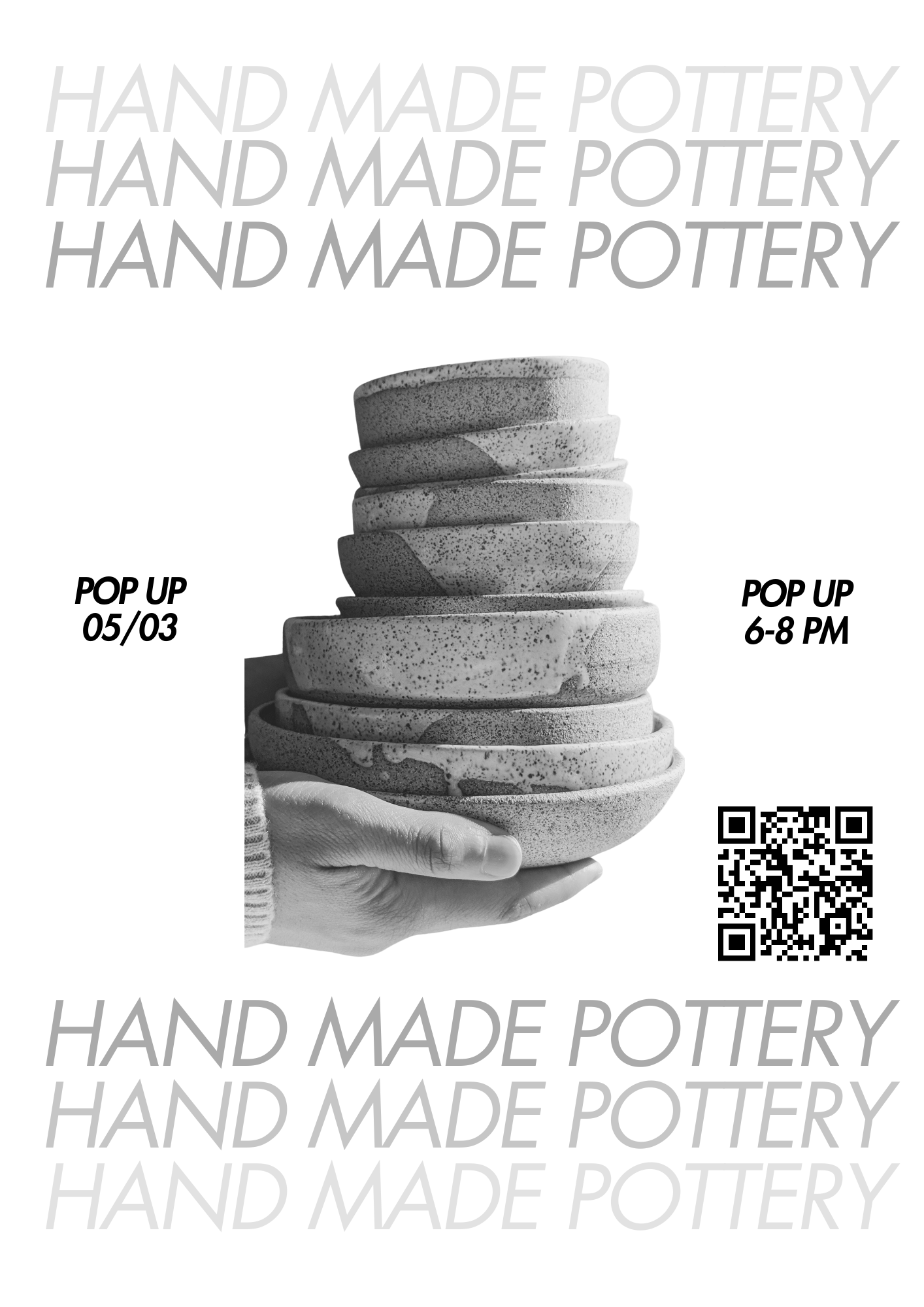
The visual identity has evolved through years of iteration: a living website I’m always refining, a typography system built around Futura, a copy ecosystem rooted in wordplay and warmth. The black and white First Friday posters came out of a print constraint and became some of my favorite work. Swiss-influenced typography, rotated text, editorial boldness. The Wes Anderson yellow running through the event collateral wasn’t unplanned; it became the thread.
What I’d do differently: I’m still doing it. That’s the point.